Instructions
Note: Your data file can include more than one outcome variable.
Follow these steps to prepare and upload your data:
List subject identification numbers in this column (1 row/subject).
List the group names in this column.
Enter values for each continuous outcome variable in the next columns (1 variable per column). The column name will appear as the variable label in the interactive graph.
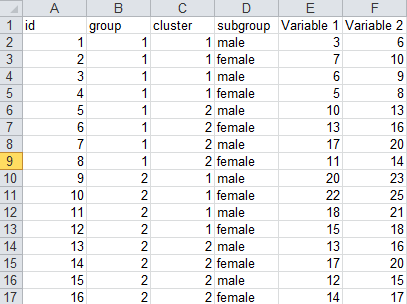
Note: Columns C and D are optional. Omit these columns if you do not wish to include clusters or subgroups.
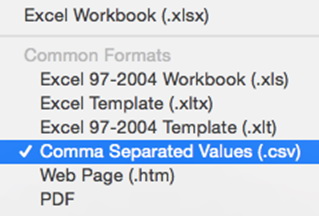
Save your data file as a “Comma Separated Values (.csv)” file.
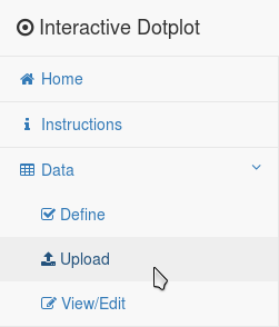
In the “Data” menu on the left side of the website , click “Upload”.
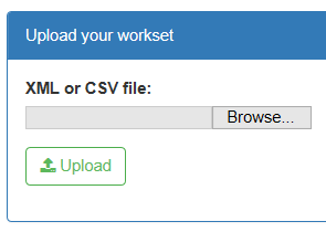
Use the “Browse” button to find and select your data file. Click “Upload”.
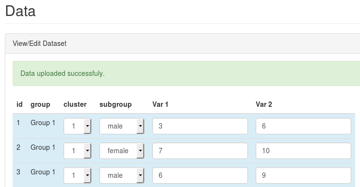
You should see something like this confirming that your data uploaded successfully:
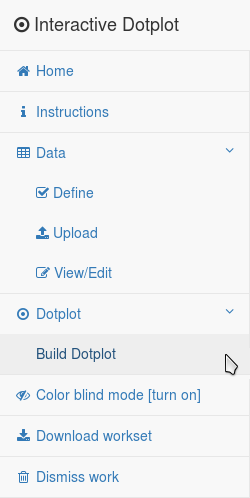
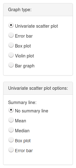
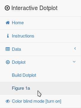
Select “Build Dotplot” from the graph menu on the left side of the screen. This will create your interactive graph. Use the options below the graph to explore and format your interactive graphic.
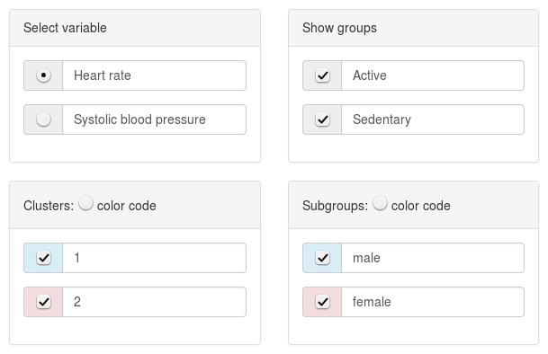
Use the "Select variable" menu to select the variable that you would like to graph.
Focus on groups, clusters, or subgroups of interest by unchecking the box next to a group, cluster or subgroup to remove these observations from the graph.
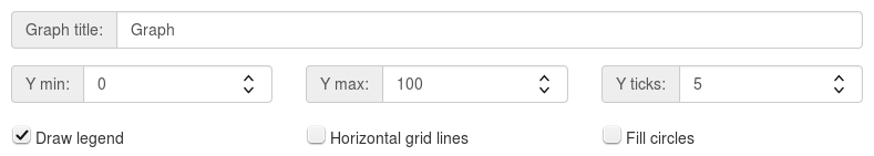
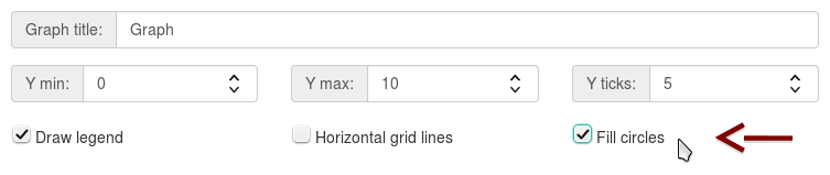
Use the textboxes to update the graph labels.
Change the y-axis label by adjusting the name of the selected variable.
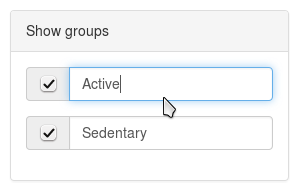
Use the group text boxes to update group names on the x-axis.
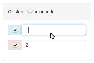
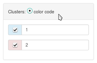
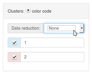
If your dataset includes clusters of non-independent data (i.e. mice from the same litter), use these textboxes to change the name of each cluster. When the “color code” option is checked, observations from different clusters will appear in different colors on the graph and cluster names will appear in the figure legend.
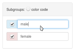
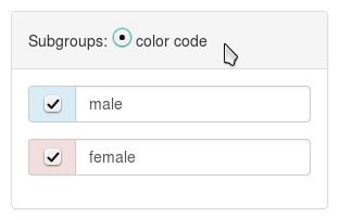
If your dataset includes subgroups, use these textboxes to change the name of each subgroup. When the “color code” option is checked, observations from different subgroups will appear in different colors on the graph and the subgroup names will appear in the figure legend.
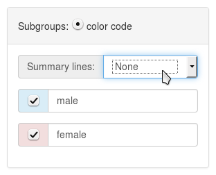
Use the "Graph Design" options to adjust the y-axis scale and title for the line graph.
Each type of plot has different options, which appear below the "Graph type" box when the plot is selected. For example, options for the dotplot allow you to add a line showing the mean or median, while options for the box plot allow you to show the data points and determine whether the width of the box is proportional to the group sample size. Use these options to explore the dataset and customize your graph.
For plots that show data points, check "Fill circles" to fill in the data points.
Clusters
If your dataset includes clusters of non-independent observations (i.e. replicates, mice from the same litter), you can show these on the graph. The third column of your datafile should be named "cluster" and include your cluster variable (see Uploading instructions).
*Please see Figure 1: Weissgerber TL, Garovic VD, Winham SJ, Milic NM, Prager EM. Transparent reporting for reproducible science. J Neurosci Res. 2016 Jul 5.
Whenever "color code" is selected, a legend for clusters will appear on the graph. You can change the name of each cluster in the legend by entering the desired name in the text box next to that cluster (see above). To remove the legend, uncheck "Draw legend" below the y-axis scale options.
Subgroups
You can include one subgroup variable in your dataset. For example, if you are comparing sedentary vs. exercise trained participants, you could use the subgroup option to show observations from men and women in different colors. If you do not have a cluster variable, the third column of your graph should be named "subgroup" and include your subgroup variable (see Uploading instructions). If you have a cluster variable, the "subgroup" variable should appear in the the fourth column of your dataset.
Whenever "color code" is selected, a legend for subgroups will appear on the graph. You can change the name of each subgroup in the legend by entering the desired name in the text box next to that subgroup (see above). To remove the legend, uncheck "Draw legend" below the y-axis scale options.
You can save specific graphs that you want to appear in your print publication.
Saving a graph allows you to download a tif file containing the graph for your paper,
and also makes the saved graph a part of the xml file that contains your interactive dotplot.
When readers upload the xml file into the web-based tool, all saved graphs will appear in the Dotplot menu on the left side of the screen.
Readers can click on saved graphs to view and explore graphs that you saved or use the tools on the site to explore other aspects of the data.
To save graphs created in either the main tab or the "Cutoff" tab:
Create the graph that you want to save.
Scroll down to the options below the graph. Enter a name under "Save this graph as:", then click "Save".

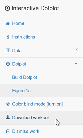
The graph that you saved will be listed under "Dotplot" in the menu on the left side of the screen.
You can click on the graph name at any time to view the graph, save an updated version of the graph or delete the graph.

Repeat steps 1 ‐ 4 to create and save all the graphs that you want to save.
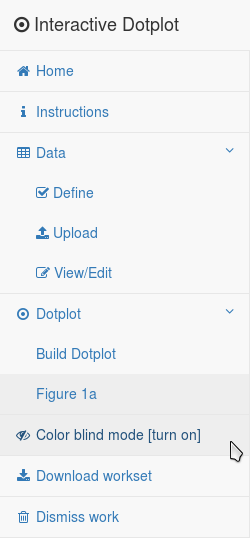
When you are finished, select “Download workset” from the menu of the left side of the screen.
Select “Complete Zip” from the pop-up window.
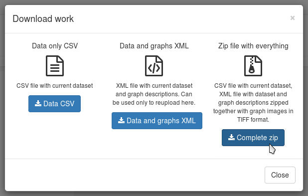
Follow the prompts to save the zip file; then open the folder containing your files. The tif files contain images of each graph that you saved. The xml file contains your interactive line graph. You can upload this as a data supplement for your paper. Readers can upload the xml file into this website to view your interactive line graph. The csv file contains your data in a format that can be used by statistics programs.
Color blind mode can be switched on and off for the entire site.
Click on “Color blind mode” in the menu on the left side of the screen to view the graph in a color-blind safe color scheme.
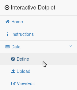
If your data did not upload successfully, there may have been a problem with the column labels (id, group, cluster, subgroup) or the column order. Select “Define” from the Data menu on the left side of the screen.
Use the menu to enter the number of groups, group sizes, group names, number of conditions, and condition labels. Click on “Don’t save, just download template csv file”.
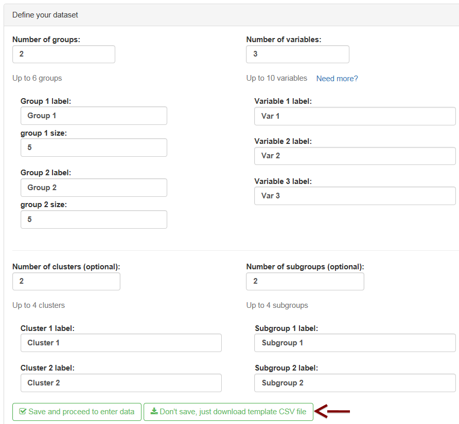
Enter the data for each subject in the template file that you downloaded. Save the csv file; then upload it using the “Upload” option under the “Data” menu on the left side of the screen.